symbol for strong
3788 results found
-

Prompt: seabed, with a strong wave where you can see an eye, a flat raised stone in front, with Viking symbols, HD, 4K
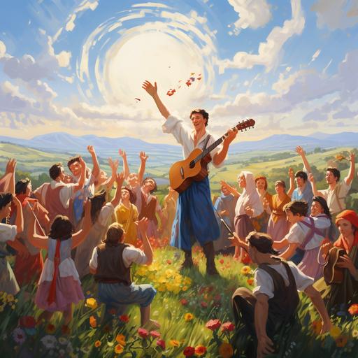
Prompt: phoenix tattoo design, Irezumi, black and white, neo-traditional Japanese tattoo, epic, manieristic, elaborate, refined, high detail, lineart, strong crisp lines, symmetrical, masterpiece, full back tattoo, symbolism --v 4 --q 2
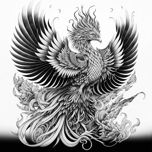
Prompt: The image depicts two strong pigs, both dressed in soldier uniforms, standing next to each other and exchanging a handshake. The pigs have comical facial expressions and appear ready to collaborate in the scene. This humorous juxtaposition between pigs and soldier attire can be amusing or symbolize a specific concept depending on the context of the image
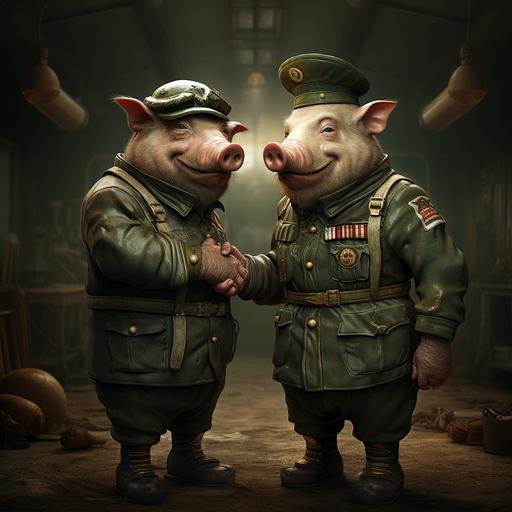
Prompt: imagine a realistic depiction of the friendship between the Ukrainian and Georgian people, set against a backdrop of the Ukrainian countryside. In the foreground, a group of Ukrainian and Georgian people are standing together, hand in hand, and singing songs. The people are smiling and laughing, and there is a sense of joy and camaraderie in the air. The image is symbolic of the strong bond between the two peoples, and their shared commitment to freedom and democracy.
-
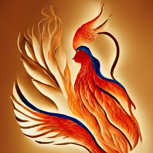
Prompt: phoenix bird on fire emerging out of the fire; lady; women; feminine; strong; orange fire; blue fire; red fire; 2d; fire department badge; firefighter; passion; symbolic;

Prompt: Logo Description for DryBites: The DryBites logo boldly features a distinctive and masculine interpretation of a nussbaum (walnut) leaf. Crafted with strong, clean lines, the minimalist design exudes strength and simplicity, resonating with the brand's commitment to rugged functionality. The walnut leaf symbol, while maintaining its essential form, now carries a more pronounced and angular structure. This modification adds a touch of masculinity to the logo, ensuring that it appeals to individuals like Mark Hunter who appreciate a robust and straightforward aesthetic. Accompanying the symbol is the brand name, "DryBites," presented in a bold and clear sans-serif font. The color palette remains grounded in earthy tones, utilizing deep browns and greens to reinforce the brand's connection to nature and the outdoors. In essence, the DryBites logo, with its masculine walnut leaf symbol, creates a strong visual identity. It not only signifies the simplicity and functionality of the brand but also resonates with individuals who value a rugged and assertive approach to their outdoor experiences.
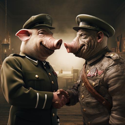
Prompt: The image depicts two strong pigs, both dressed in soldier uniforms, standing next to each other and exchanging a handshake. The pigs have comical facial expressions and appear ready to collaborate in the scene. This humorous juxtaposition between pigs and soldier attire can be amusing or symbolize a specific concept depending on the context of the image

Prompt: advanced artistic design letters logo text words "Curency Exchange" in the circle 3d logo fat lines and dots elegant logo design, circle solited on 8 parts each part have different curency symbols, symmetric, black background, simple illustration, superflat style illustration, strong linear elements, minimalist, --niji 6
-
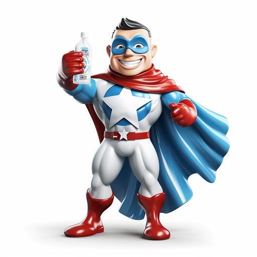
Prompt: Create a superhero character for a cleaning product. Strong, white smile, masked, uniform with a chest symbol (C with a small star shining), colors: blue, white, red. Holding a cleaning cloth. No background.
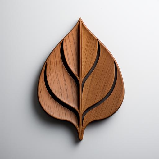
Prompt: Logo Description for DryBites: The DryBites logo boldly features a distinctive and masculine interpretation of a nussbaum (walnut) leaf. Crafted with strong, clean lines, the minimalist design exudes strength and simplicity, resonating with the brand's commitment to rugged functionality. The walnut leaf symbol, while maintaining its essential form, now carries a more pronounced and angular structure. This modification adds a touch of masculinity to the logo, ensuring that it appeals to individuals like Mark Hunter who appreciate a robust and straightforward aesthetic. Accompanying the symbol is the brand name, "DryBites," presented in a bold and clear sans-serif font. The color palette remains grounded in earthy tones, utilizing deep browns and greens to reinforce the brand's connection to nature and the outdoors. In essence, the DryBites logo, with its masculine walnut leaf symbol, creates a strong visual identity. It not only signifies the simplicity and functionality of the brand but also resonates with individuals who value a rugged and assertive approach to their outdoor experiences.
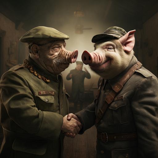
Prompt: The image depicts two strong pigs, both dressed in soldier uniforms, standing next to each other and exchanging a handshake. The pigs have comical facial expressions and appear ready to collaborate in the scene. This humorous juxtaposition between pigs and soldier attire can be amusing or symbolize a specific concept depending on the context of the image

Prompt: advanced artistic design letters logo text words "Curency Exchange" in the circle 3d logo fat lines and dots elegant logo design, circle solited on 8 parts each part have different curency symbols, symmetric, black background, simple illustration, superflat style illustration, strong linear elements, minimalist, --niji 6
-
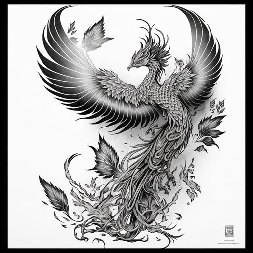
Prompt: phoenix tattoo design, Irezumi, black and white, neo-traditional Japanese tattoo, epic, manieristic, elaborate, refined, high detail, lineart, strong crisp lines, symmetrical, masterpiece, full back tattoo, symbolism --v 4 --q 2
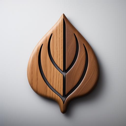
Prompt: Logo Description for DryBites: The DryBites logo boldly features a distinctive and masculine interpretation of a nussbaum (walnut) leaf. Crafted with strong, clean lines, the minimalist design exudes strength and simplicity, resonating with the brand's commitment to rugged functionality. The walnut leaf symbol, while maintaining its essential form, now carries a more pronounced and angular structure. This modification adds a touch of masculinity to the logo, ensuring that it appeals to individuals like Mark Hunter who appreciate a robust and straightforward aesthetic. Accompanying the symbol is the brand name, "DryBites," presented in a bold and clear sans-serif font. The color palette remains grounded in earthy tones, utilizing deep browns and greens to reinforce the brand's connection to nature and the outdoors. In essence, the DryBites logo, with its masculine walnut leaf symbol, creates a strong visual identity. It not only signifies the simplicity and functionality of the brand but also resonates with individuals who value a rugged and assertive approach to their outdoor experiences.
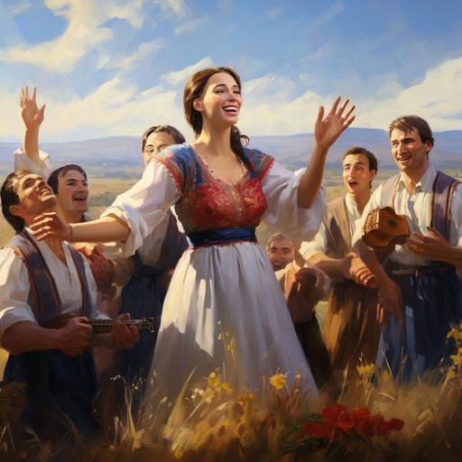
Prompt: imagine a realistic depiction of the friendship between the Ukrainian and Georgian people, set against a backdrop of the Ukrainian countryside. In the foreground, a group of Ukrainian and Georgian people are standing together, hand in hand, and singing songs. The people are smiling and laughing, and there is a sense of joy and camaraderie in the air. The image is symbolic of the strong bond between the two peoples, and their shared commitment to freedom and democracy.

Prompt: In this heartwarming cartoon, a strong lumberjack mom, a gentle but not-so-strong dad, and their adorable daughter stand together, embodying the essence of a loving and harmonious family.